MOVING HELP REDESIGN
Website Layout, UI/UX
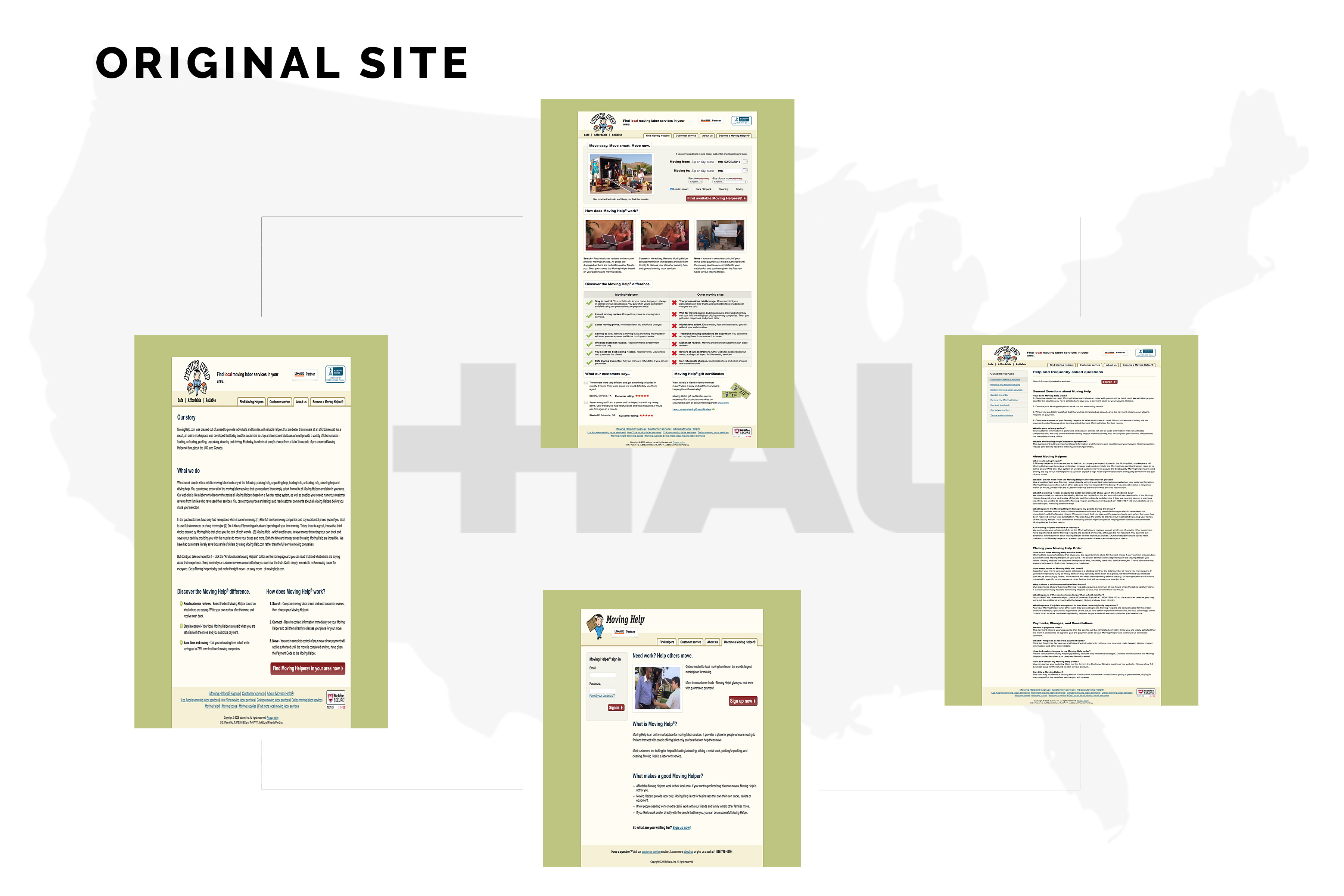
I conducted research on a braod variety of individuals in preparation for this project and recorder my findings in an empathy map dedicated to improving the overall usability of the legacy website, via user feedback. Seen below is the old webpage for movinghelp.com. The page features a drab, monochromatic design, coated in SEO-baiting text, which loses the user almost immediately. The imagery is blurry, the copy is dull, and the call-to-action is nearly hidden from the user's eyesight. This subsite of uhaul.com was in drastic need of a redesign. THere is limited functionality past the initial search and a lack of filtering is inherently evident.
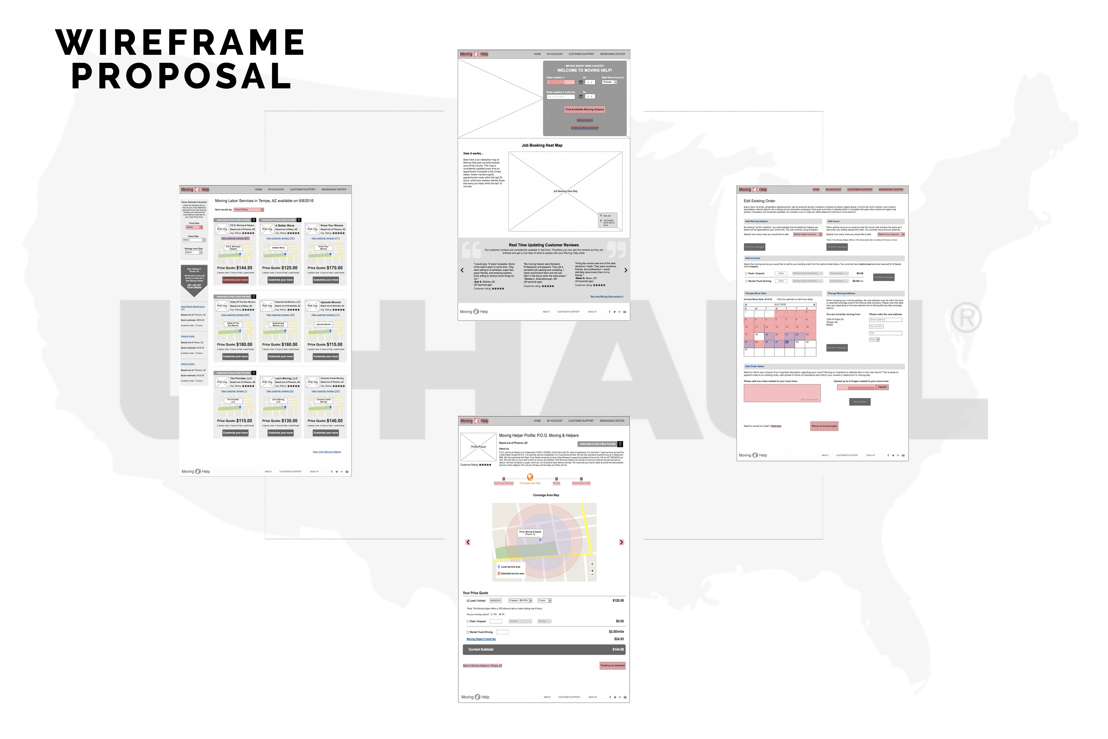
The next image the wireframe proposals which I created to improve & bolster the accessibility of the site's primary content. Users could now access a large-scale list of movers in their locale, based on several different search criteria, such as customer review rating, amount of jobs completed, and range of availability within a mileage setting.
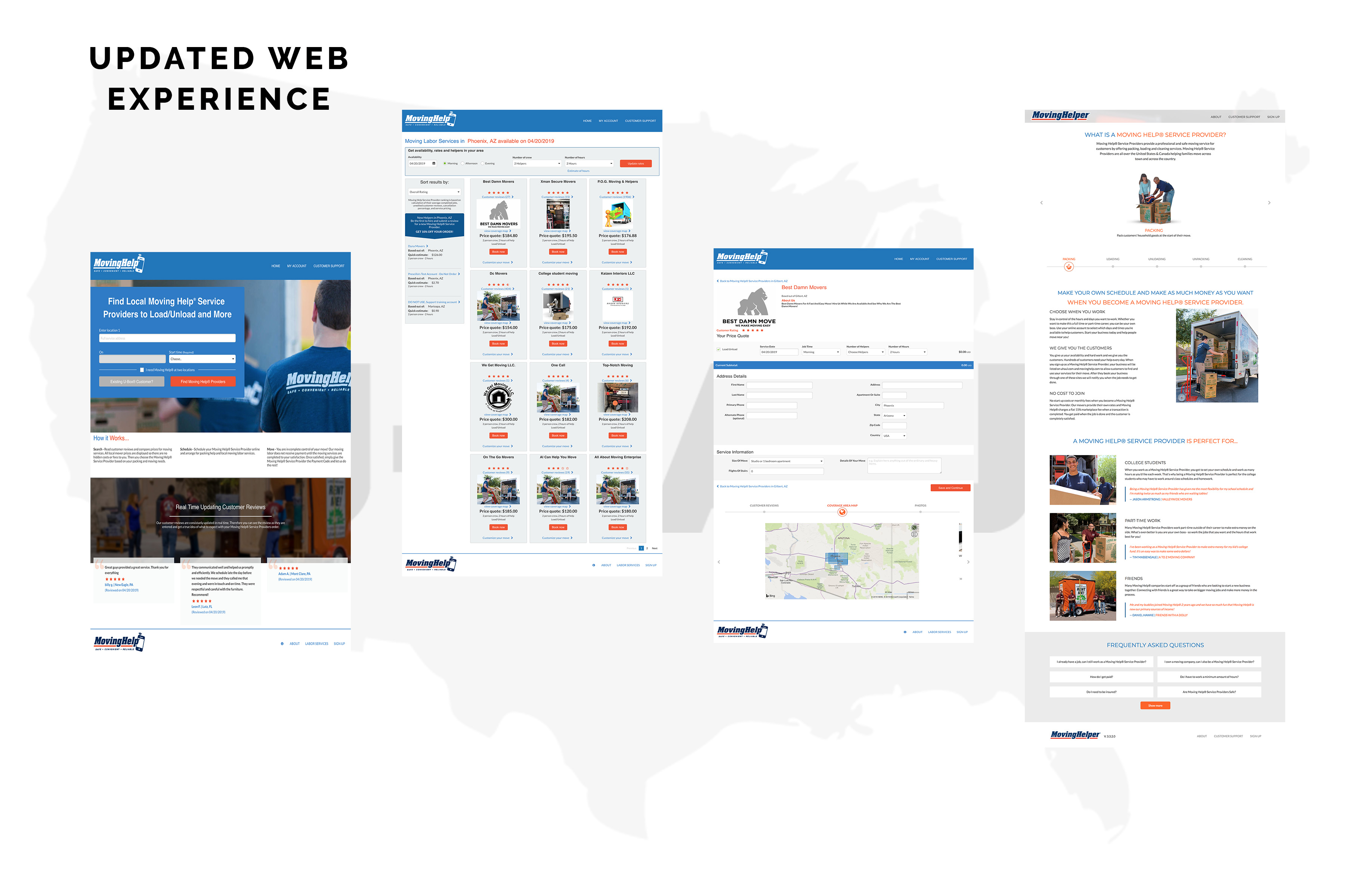
The final image represents the complete & implemented site currently available on movinghelp.com The user is no longer overwhelmed with relentless SEO text and instead is treated to an improved search experience, with upgraded aesthetic appeal.
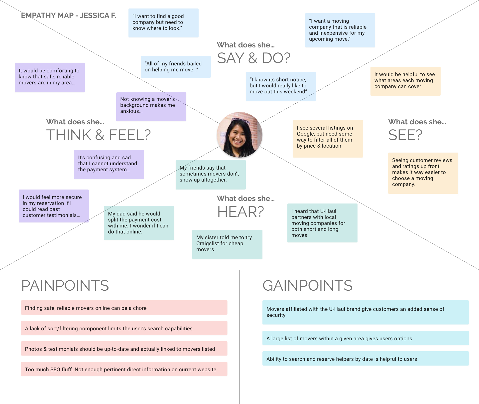
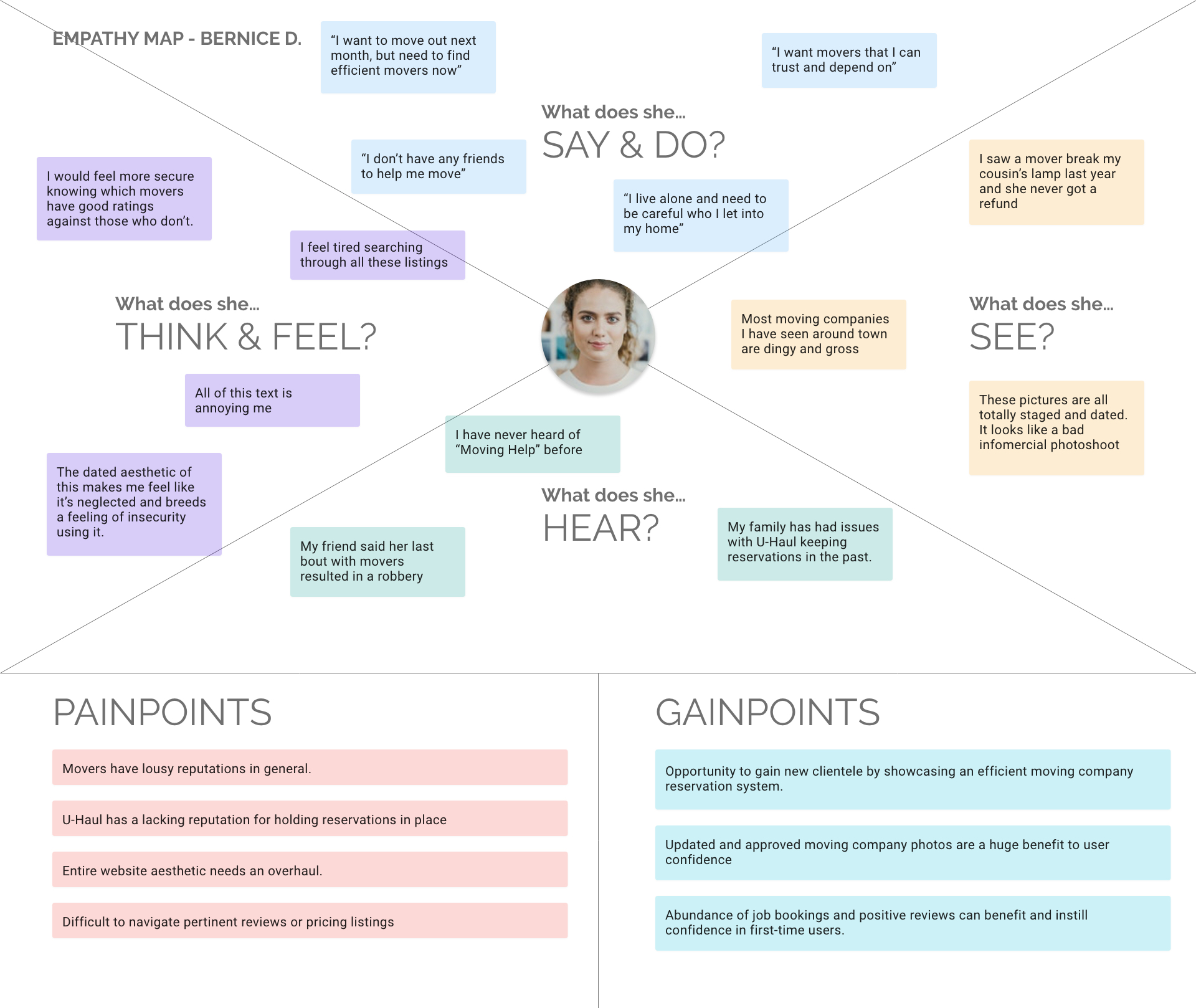
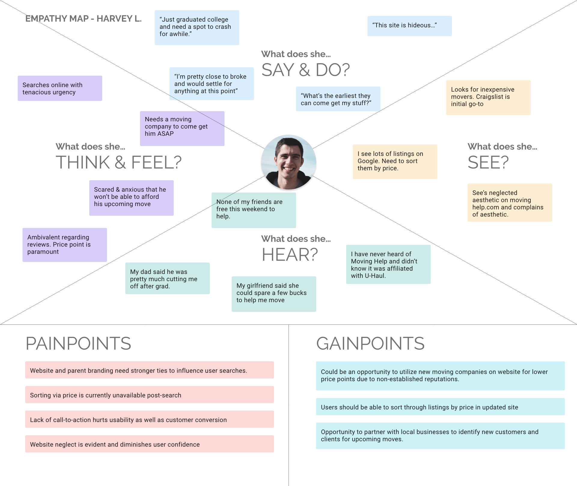
EMPATHY MAPPING